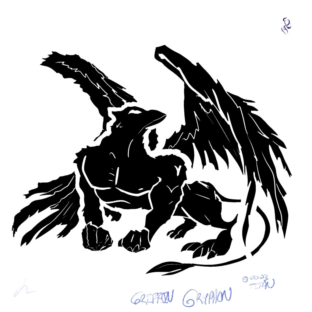
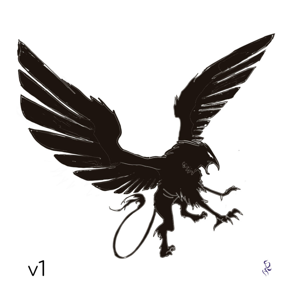
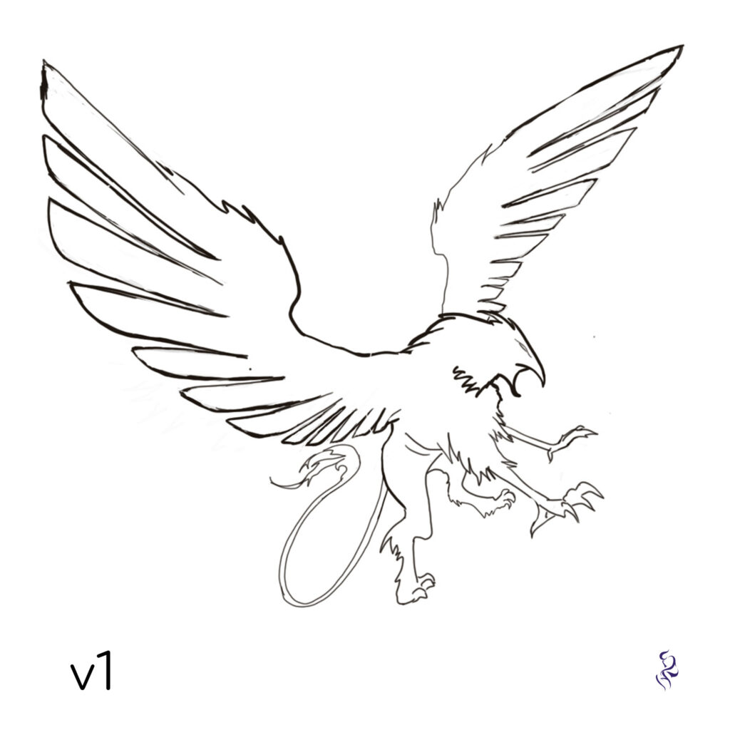
We wouldn’t normally share every version of a logo we came up with, but this one was super badass and distinct from v1 that it’s worth sharing. This version is more “badass” and with far more muscularity—i.e. “swole”—and the wings are epic… and generally, the client was looking for something more friendly and flowy. But, when it comes to character design, logo design, and iconography, this version stand out as distinct, which is cool in-and-of-itself.